TPM Global.
A Trade Promotion Management platform from Telus Agriculture & Consumer Goods — serving global enterprise clients across Oceania, Asia, and Europe.
My role.
I joined TPM Global from the very beginning of the redesign initiative as Product Designer with end-to-end ownership of the experience — shaping the foundational UX direction, redesigning core flows, and establishing patterns that would scale across the entire platform. As the main point of contact with stakeholders, I led the alignment meetings and design decisions, with the goal of making the product dramatically more efficient and intuitive for daily enterprise use.
Impact.
The redesign led to dramatic usability improvements, validated through moderated user testing and data gathering after implementation, which helped build a great relationship with the stakeholders.
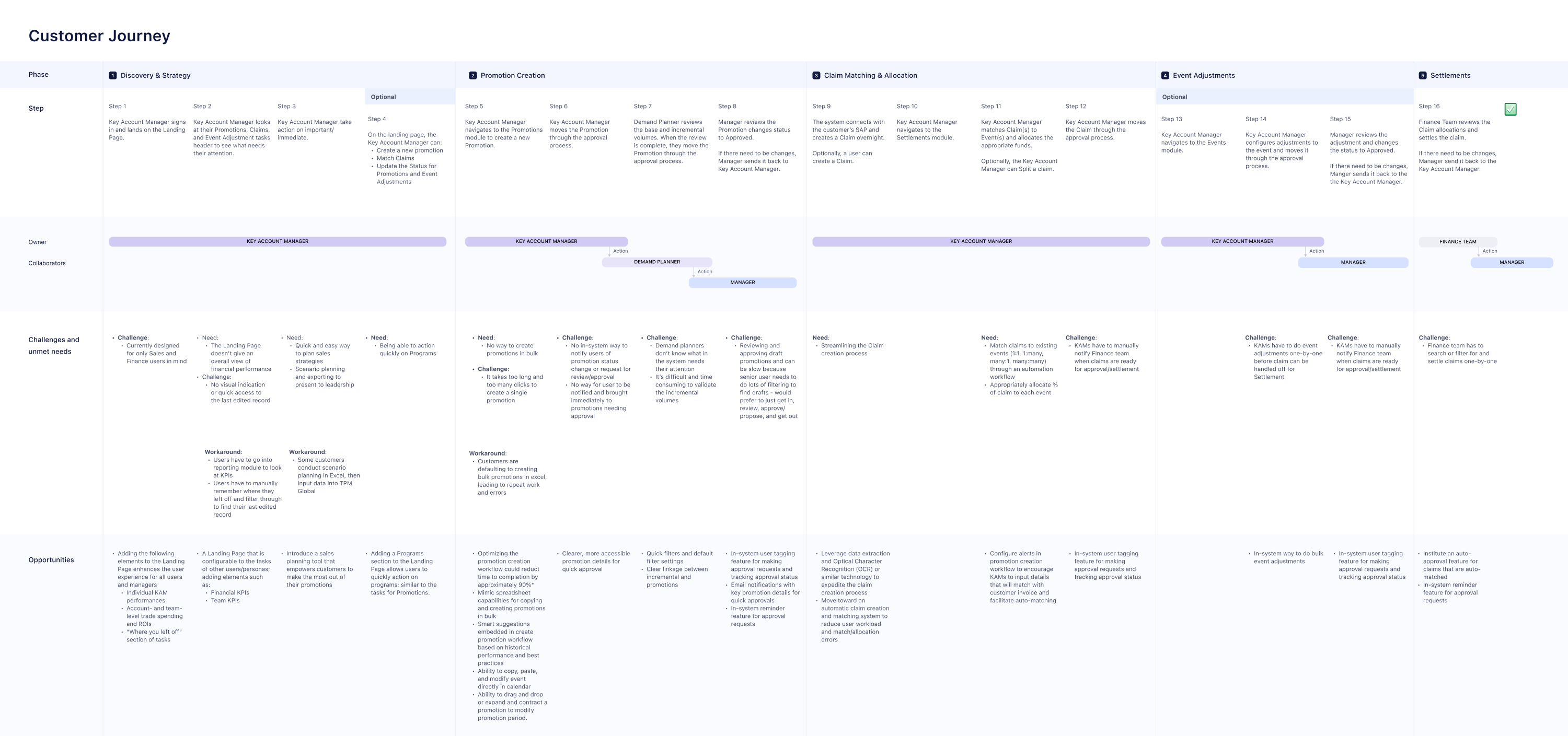
The problem.
Users had to navigate through multiple screens and perform repetitive interactions just to answer basic questions like:
- What promotions are running right now?
- How do this year's promotions compare to last year?
- Where should I focus my attention today?
The primary challenge was to reduce cognitive load and interaction cost while preserving the depth and power required by enterprise users managing complex trade operations.
With that in mind, the main objective of the redesign was clear:
Reduce the number of clicks, pages, and mental effort required to access meaningful data and manage promotions.
Original design.
The platform enables users to define and manage promotions and long-term programs — orchestrating complex trade promotion strategies across regions and timeframes.
The legacy TPM Global experience was highly fragmented and difficult to navigate. It relied heavily on dense tables and multi-page flows, closely resembling a large spreadsheet rather than a modern digital product.
The biggest challenge in this redesign process was finding ways to turn spreadsheets and tables into fast and accessible tools, instead of burying the users in information they didn't need.
Revamping the table experience allowed us to give the users the most important information and actions to perform, saving time and money for all parties involved.
From spreadsheet to tool.
Redesign thesis
Design method.

In the early stages of the redesign, the primary business objective was to unblock a 5-person development team scheduled to begin implementation of the core dashboard. To meet this aggressive timeline, I intentionally inverted the traditional design process, delivering high-fidelity interfaces before formal research commenced.
Leveraging industry-standard UI patterns, design best practices and my expertise in enterprise tools, I established a scalable design system that served as the visual north star. By prioritizing execution-ready components, I provided the dev team with a consistent framework — keeping them fully unblocked throughout the build.
Once the initial build was unblocked, I pivoted to the next phase, collaborating closely with the research team to conduct benchmarking and competitive analysis. Together we identified industry standards and natural evolutions for trade promotion tools.
This dual-track approach allowed for immediate technical progress without sacrificing long-term UX integrity. It paved the way for a full-scale redesign of core flows, delivered with high stakeholder confidence.
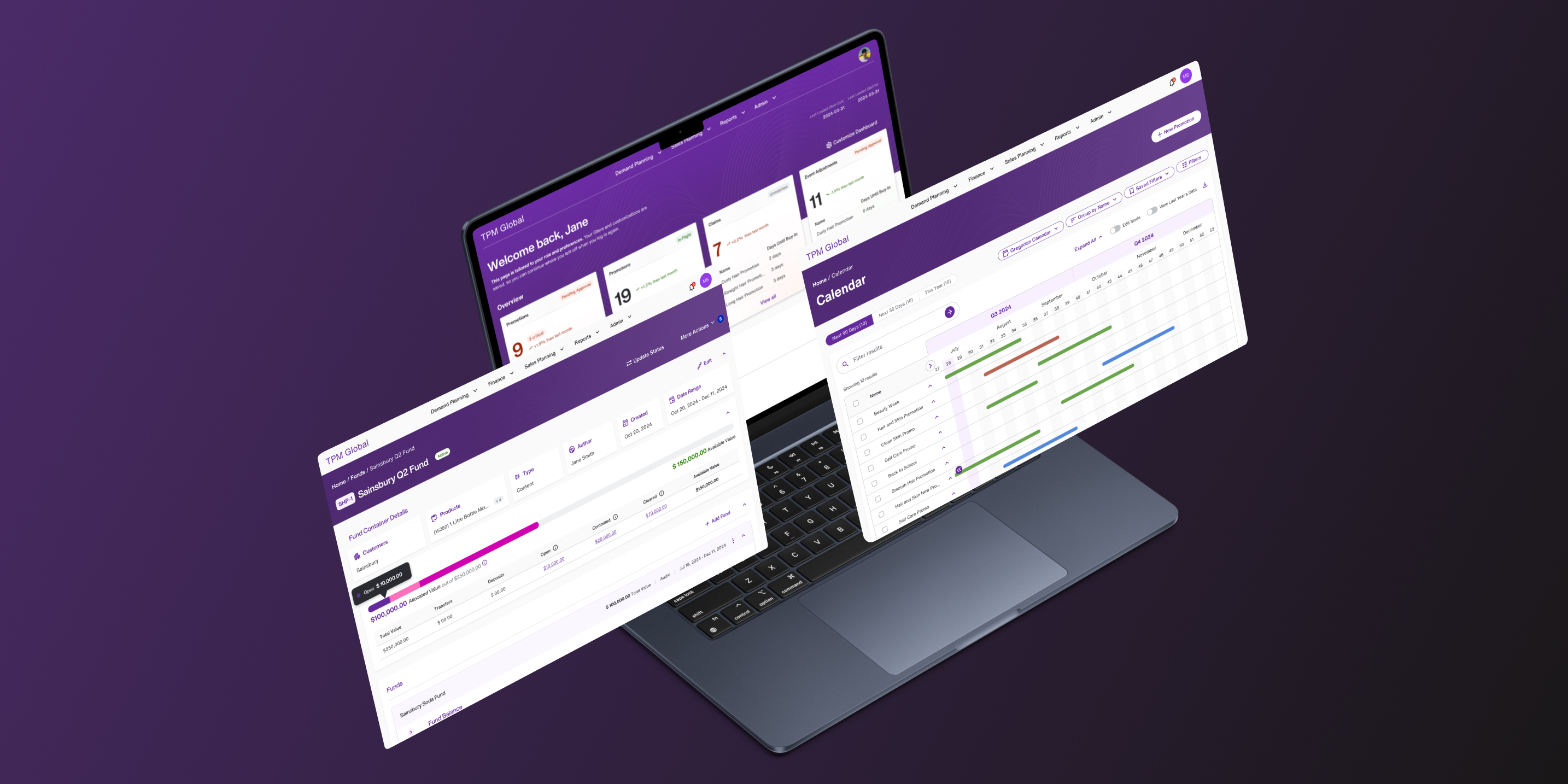
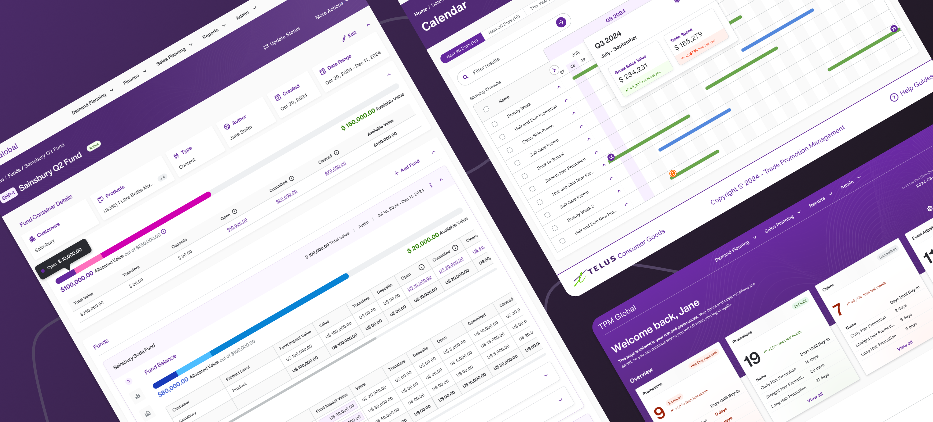
Dashboard.
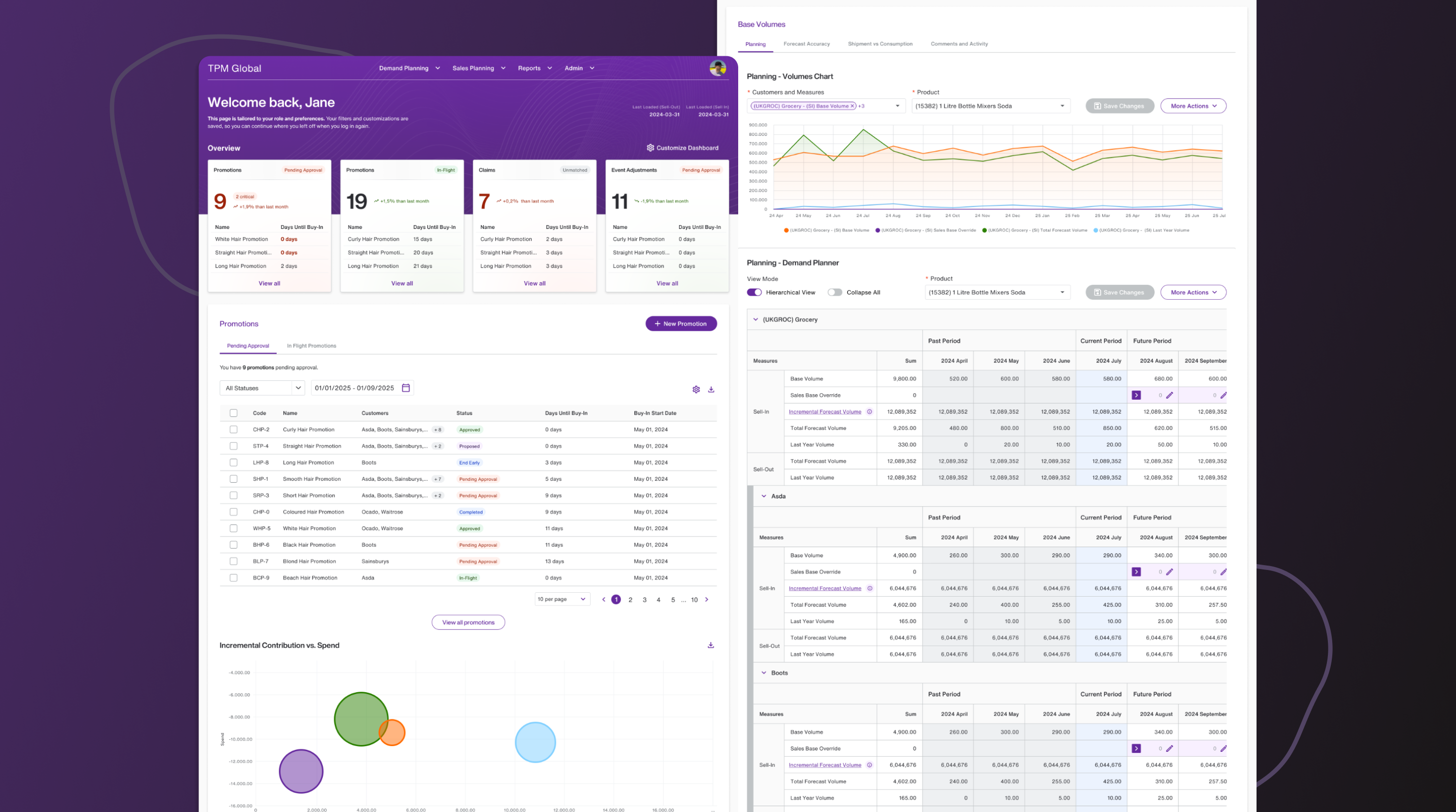
One of the most impactful early decisions was introducing a Home page. The legacy product did not have a landing page, which led to confusion for most users.
I designed a simple, information-rich dashboard that surfaced the data most users needed first:
- Current promotions
- Key Promotions and Program statuses
- High-level performance indicators
This single addition dramatically reduced navigation friction, allowing users to orient themselves immediately and act faster.
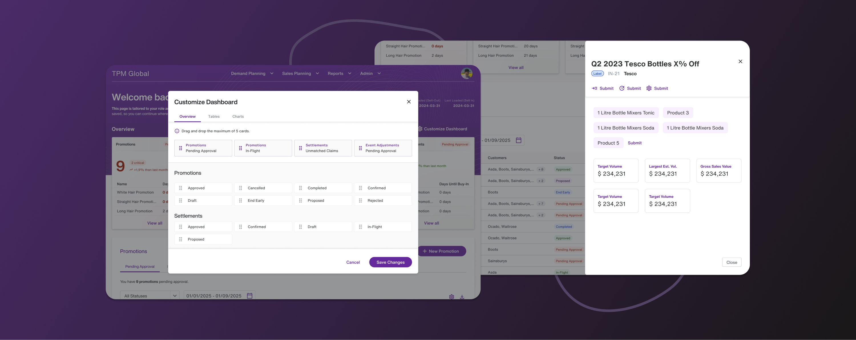
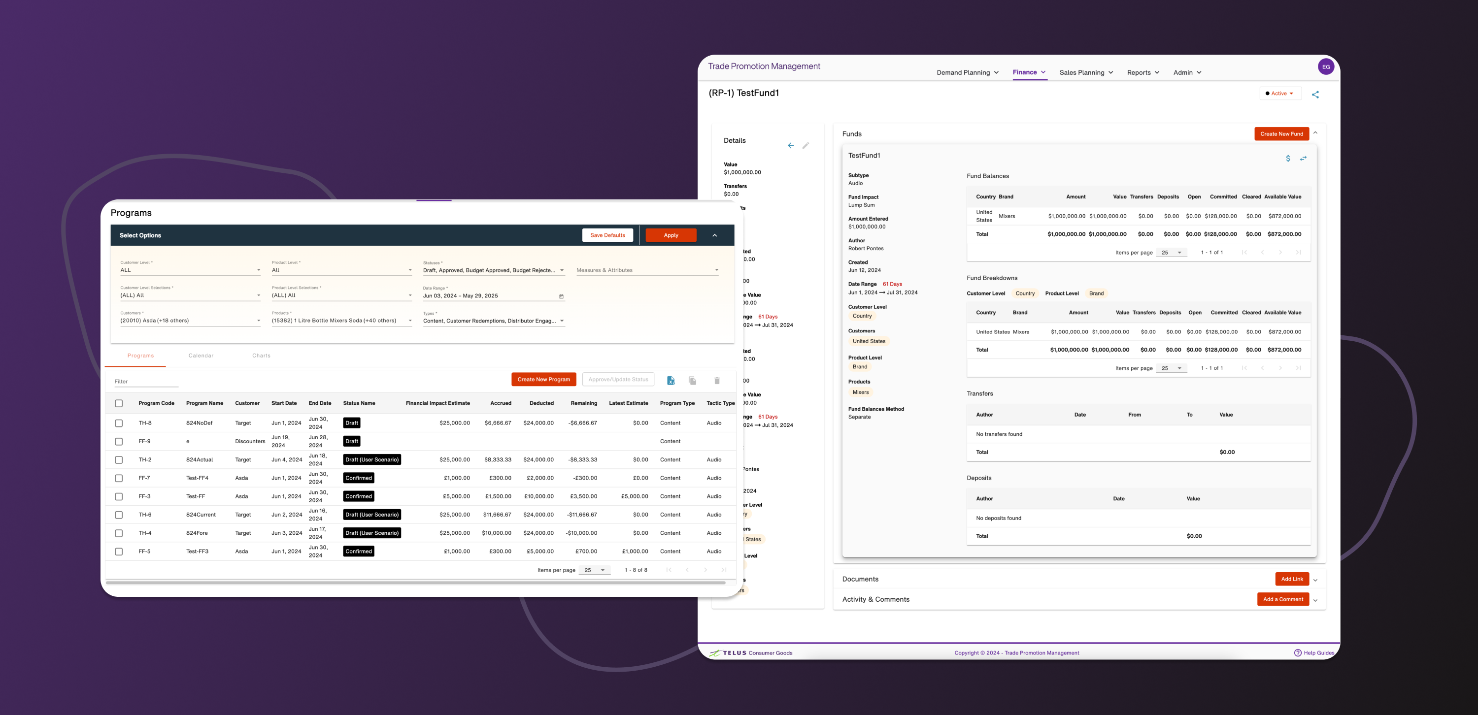
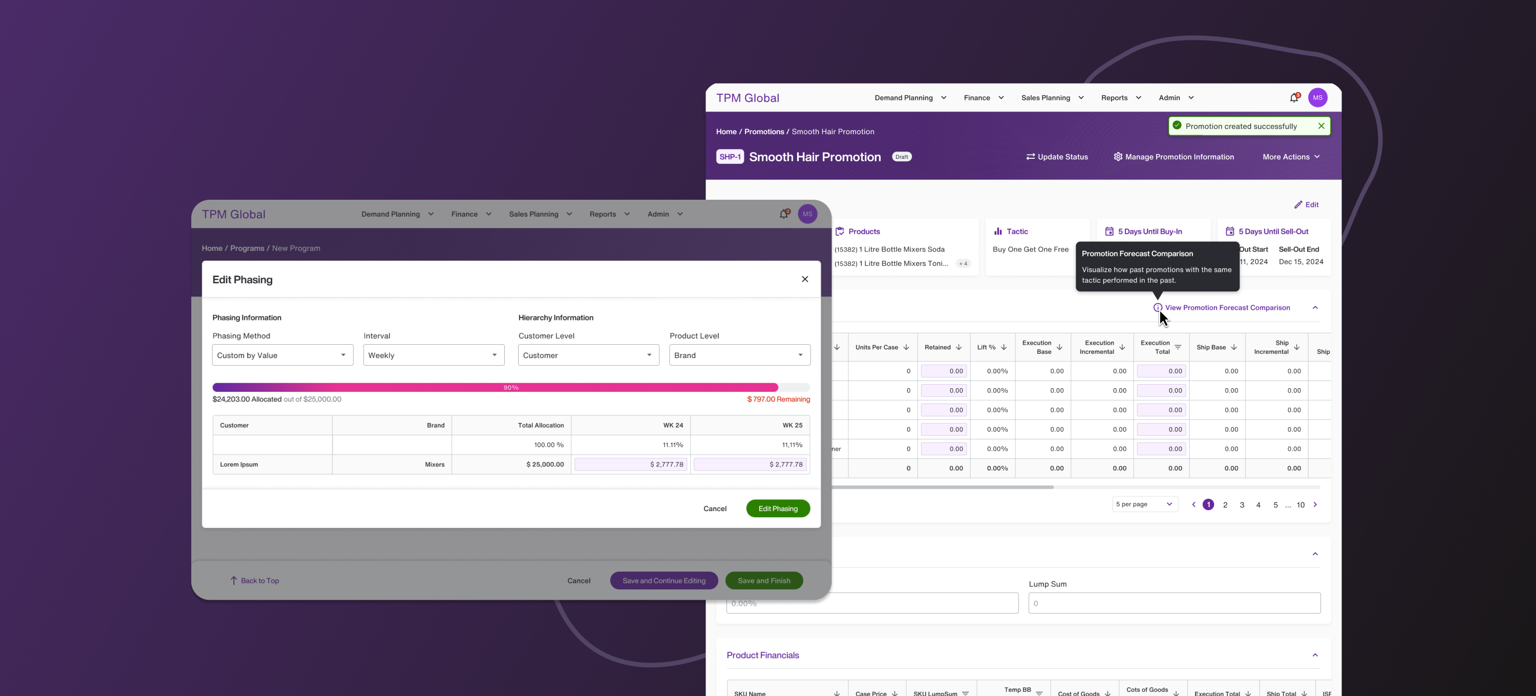
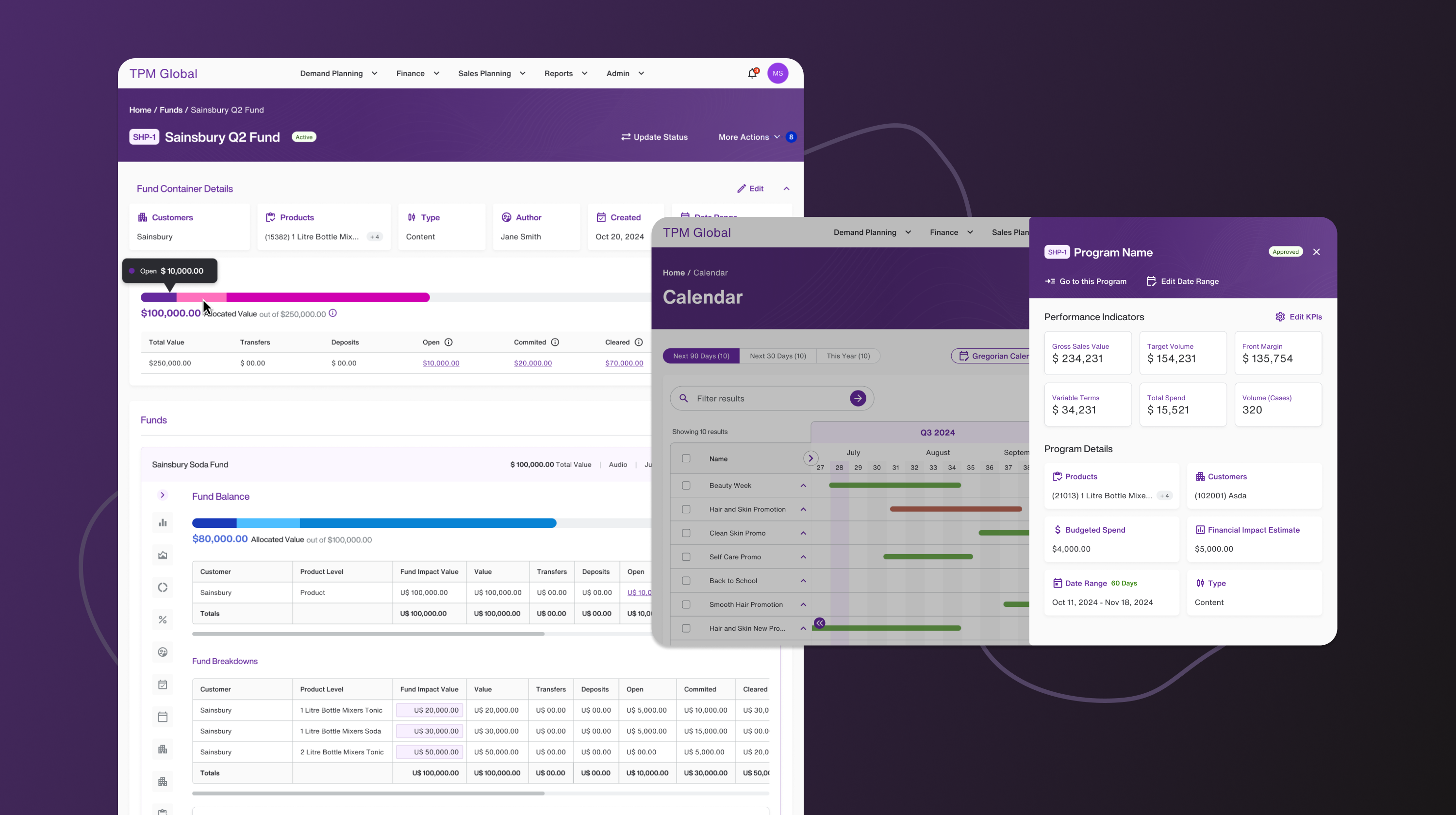
Programs and Promotions.
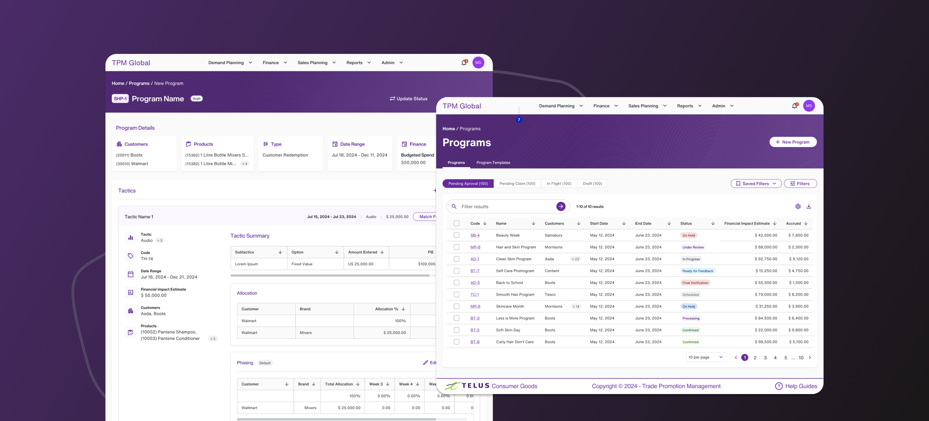
I redesigned the Programs section, which then became the structural foundation for the rest of the system. By simplifying hierarchy, improving information grouping, and clarifying actions, this redesign established patterns that were later applied across other areas of the platform — creating consistency and predictability throughout the experience.
I introduced multiple UX improvements and features that would cascade into a strong improvement for the whole product, like the ability to manage the columns on a table seamlessly; grouping the search filters — drastically improving the screen real estate for the important data; the ability to do multiple edits in the same screen, without the need for additional clicks or modals.
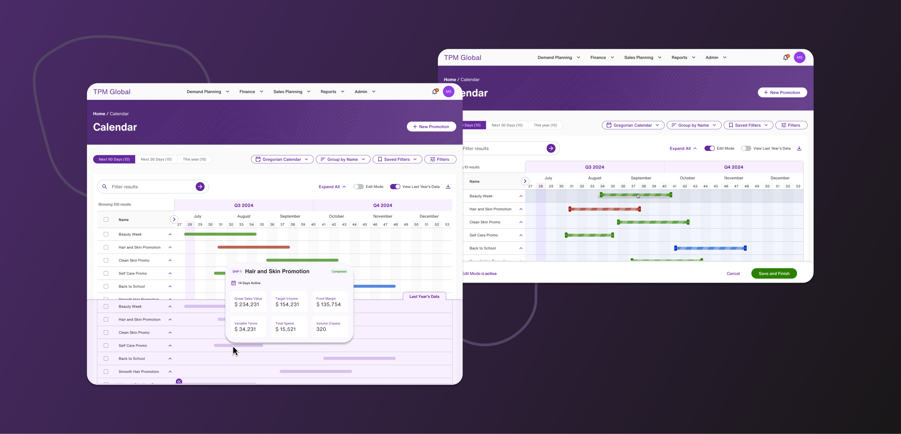
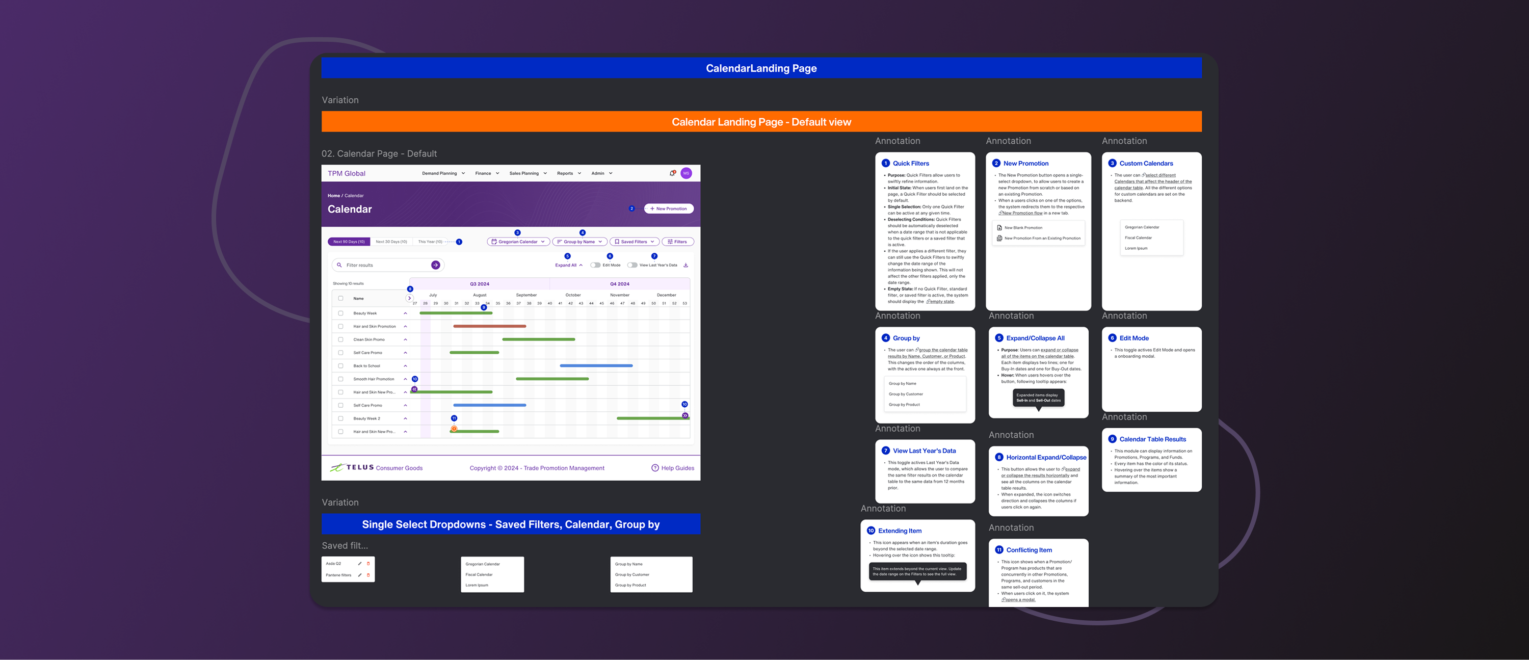
Calendar.
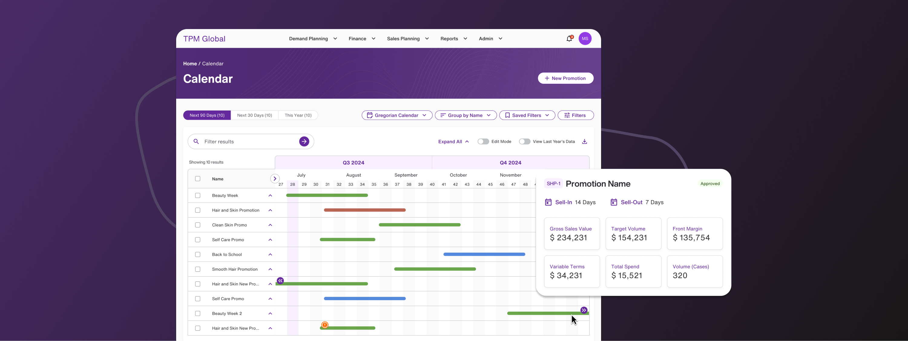
The Calendar view represented one of the biggest leaps forward in usability. I redesigned it into a visual and interactive planning tool, enabling users to view promotions across an entire year at a glance and quickly compare periods of time, understanding overlaps, gaps, and timing conflicts visually.
Combined with multiple features like edit mode, drag-and-drop editing, quick summaries on hover and sidebars, this shift empowered users to make faster, more confident decisions without jumping between multiple screens or reports.
Results and Validation.
Through user testing, the redesigned experience showed dramatically fewer interactions required to complete core tasks and a clear preference for the new flows and layouts — with 100% of users praising the changes, citing clarity, speed, and ease of use.
I added comprehensive documentation to the established design system, helping development work move faster and more consistently.
The redesign successfully transformed TPM Global from a clunky, spreadsheet-like tool into a modern, visual, and efficient enterprise platform — without sacrificing depth or flexibility.